 IT
IT  EN
EN Swiper Slider is a modern Joomla module built to create responsive sliders, galleries and content carousels using the popular Swiper.js framework. It combines fast front-end performance with flexible backend configuration and multiple layout options.
Overview
Swiper Slider is an advanced Joomla module designed for modern websites that need responsive sliders, rich media presentation and flexible visual layouts.
It is ideal for hero sections, image galleries, testimonials, product showcases and other content-driven areas where motion, navigation and mobile usability matter.
Responsive
Optimized for desktop, tablet and mobile with touch-friendly interaction.
Highly configurable
Manage slides, layout, pagination, navigation and effects from the Joomla backend.
Special layouts
Go beyond basic sliders with layouts such as Hero, Cards, Thumbs Gallery and 3D Cube.
Requirements
Swiper Slider is designed for modern Joomla installations and is positioned as a configurable slider module for current Joomla releases.
| Area | Requirement | Notes |
|---|---|---|
| Joomla | Joomla 4, 5 and 6 | Project materials and the public extension listing position the module for Joomla 4+ and current branches. |
| Template | Modern responsive template | Recommended for full-width layouts, mobile behavior and clean front-end rendering. |
| Media | Optimized images | Use properly sized images for better loading speed and visual consistency. |
| Frontend | Touch-friendly environment | The module is designed for modern responsive usage and gesture-based interaction. |
Good fit for
- Homepage hero sliders
- Photo galleries
- Product or service showcases
- Testimonials and reviews
- Interactive content blocks
Installation
- Download the latest package from GitHub or your project source.
- Open Joomla administrator and go to System → Extensions → Install.
- Upload the package and wait for the installation confirmation.
- Create or open the module instance in the backend.
- Configure slides, layout and publishing options, then assign the module position.
Backend-driven setup
The module is intended to be configured from the Joomla backend, where layout, navigation, pagination and many other settings can be adjusted.
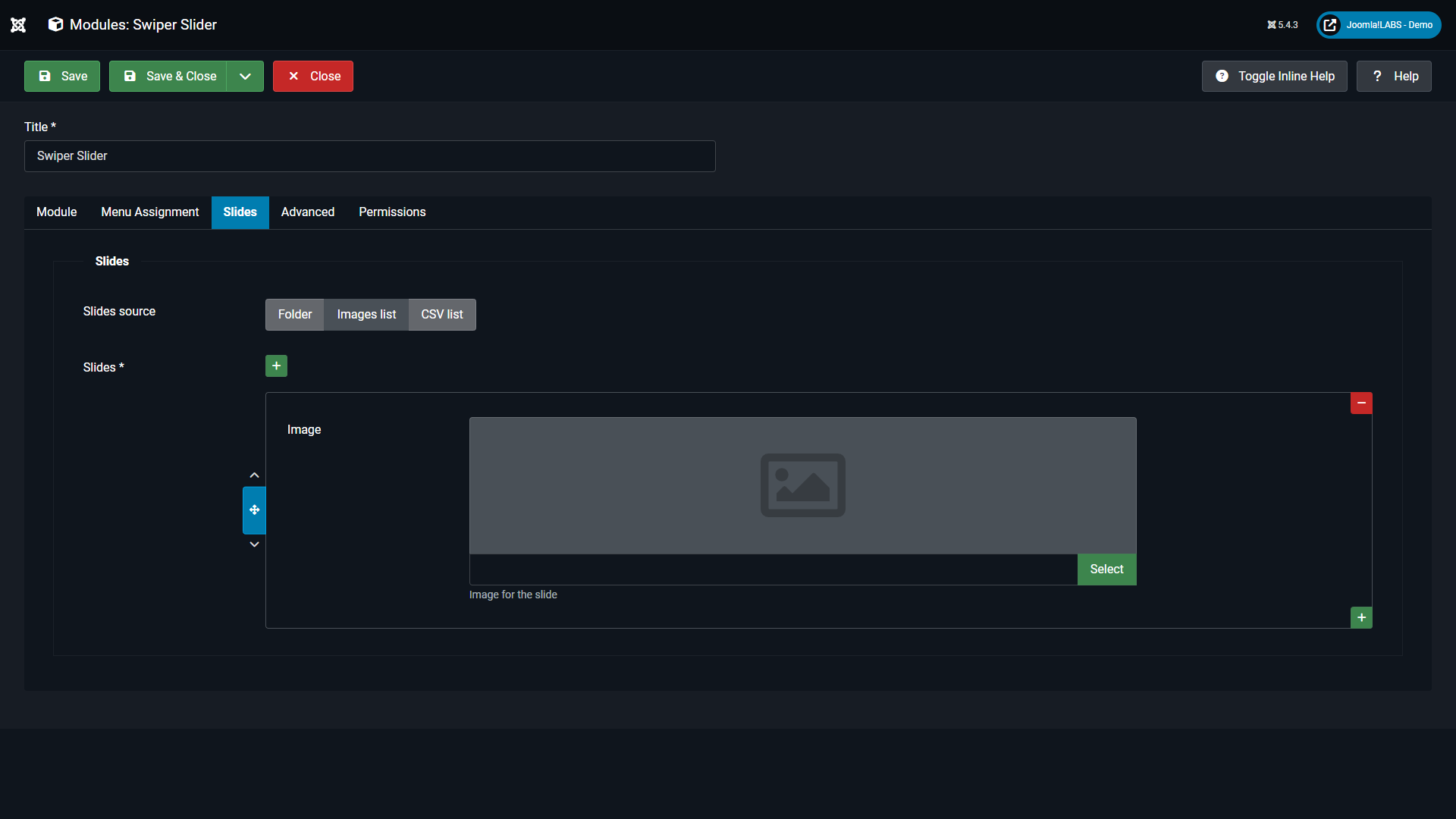
Slides management
Add and organize the slides directly in the module configuration to build image-based or content-oriented sliders.
Configuration
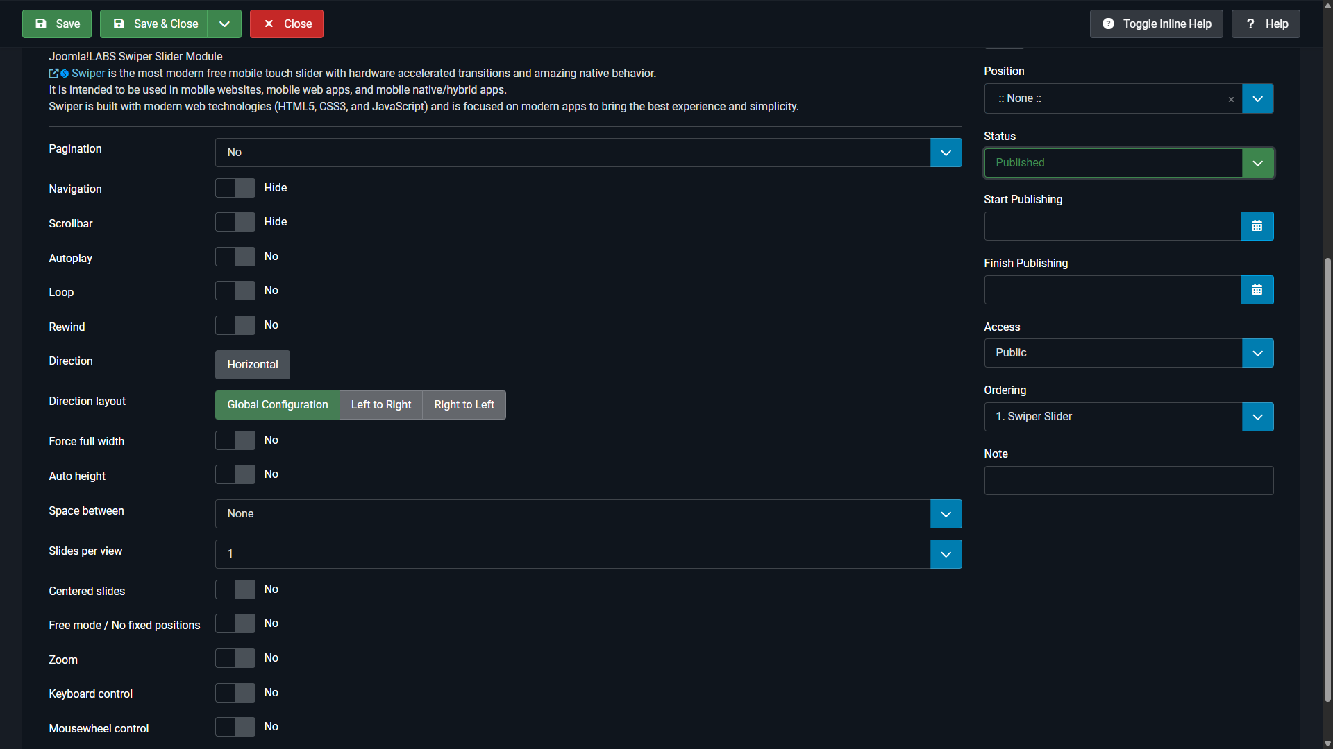
Swiper Slider is built to be simple at first use and flexible when you need more advanced output. Standard configuration usually starts with slides, layout, navigation and pagination.
Core settings
Configure slide content, autoplay, loop, navigation controls, pagination style and responsive behavior.
Visual behavior
Adjust transitions, layout templates and display options to match the section where the module is published.
Responsive setup
Test the output on desktop and mobile so height, spacing and text overlays behave correctly in your template.
Layouts and effects
Swiper Slider supports both standard slider configurations and more distinctive visual layouts. This makes it suitable for clean editorial sliders as well as more immersive showcase sections.

Cards
A distinctive layered layout suitable for modern showcases, featured content and visually rich sections.

3D Cube
A more dynamic effect for promotional areas, demo pages and situations where motion is part of the visual impact.

Thumbs Gallery
A practical gallery-oriented layout where users can browse slides through thumbnails.

Hero layout
The Hero layout works best when the module is published in a full-width template position.
Important note for Hero
If you want to use the Hero layout properly, publish the module in a template position that spans the full page width.
In Cassiopeia, a good example is the banner position.
If the module is published in a narrow content column or inside a constrained container, the Hero layout will lose much of its intended visual effect.
Recommended approach
- Use Hero for homepage top sections and major landing headers.
- Prefer full-width template positions.
- Use large, high-quality images with safe text areas.
- Check overlay text and buttons on mobile screens.
Examples
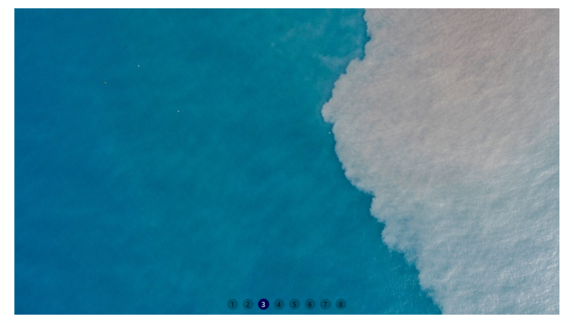
The module is already demonstrated with multiple public examples, including Cards, Thumbs Gallery and pagination variants, which makes example-driven documentation especially useful here.
Standard configuration
Use standard pagination and navigation when clarity matters more than visual experimentation.
Special layouts
Choose Cards or 3D Cube when you want the slider itself to act as a design element, not only as a content container.
Gallery use
Use Thumbs Gallery when the user should be able to navigate visually through multiple images.
Accessibility
Project materials highlight accessibility-related features such as keyboard navigation, ARIA labels, automatic ALT text behavior and proper focus management.
Keyboard support
Helpful for users who navigate sliders without touch or mouse interaction.
ARIA labels
Improve clarity for assistive technologies and screen readers.
ALT text handling
Supports more accessible image presentation when media is prepared correctly.
Focus management
Important for interactive modules embedded in content-heavy pages.
Best practice
- Use meaningful slide titles.
- Prepare readable overlay contrast.
- Check mobile tap targets and spacing.
- Avoid overly aggressive autoplay in content-heavy pages.
Troubleshooting
The slider is not visible
Check module publishing status, menu assignment and template position.
Hero layout looks constrained
Move the module to a full-width template position such as banner in Cassiopeia.
Slides look cropped badly
Review image proportions, container height and overlay spacing in the selected layout.
Layout effects feel too strong
Switch from Cards or 3D Cube to a simpler layout when readability is the priority.
Mobile behavior is not ideal
Recheck image size, text length and template spacing on smaller breakpoints.
Backend settings seem too complex
Start with a standard layout and basic pagination first, then enable advanced effects only after the base output is working.